Herod – Brand, Product & UI/UX Design
The key-focus on this design concept is a strong identity, product and online presentation of a Motocross & Enduro Boot with high performance features in a modern colorful lineup.
Work
Brand
Type
Year
Brand
A Brand should be more than just a product, it should reflect a lifestyle. Named by the Roman king Herod, the caretaker and protector of his people. That name and signet fits perfect for a motocross safety gear brand. The mask signet and the bold typography pays tribute to strength and power.
Corporate Identity
Due to the monochromaticity of the corporate identity, we can used the logo in all colors. And the mask’s signet, with its wild hairstyle, can be used universally as an element in layouts, advertising and on the products.
Product Design
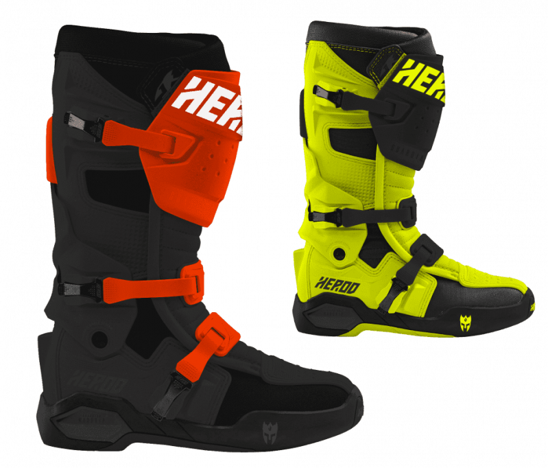
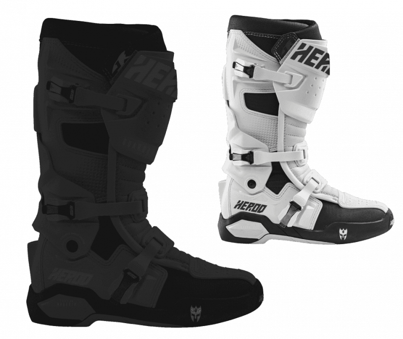
The motocross world has become more colorful over the years. For this reason the product design has been expanded with bright colors in orange and neon. The product name was also chosen specifically and fits very well with the brand name.
UI/UX Design
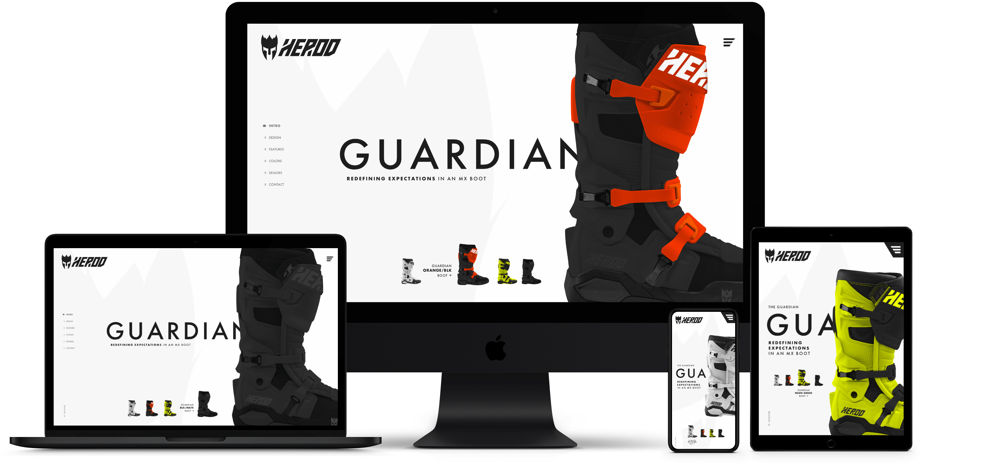
The website is fully responsive designed as a full-screen landing page. The modern and clean design puts the focus on the product and it’s color variants. In terms of content, the page also includes the technical and safety aspects, as well as the sales information for distribution clients.


Tablet
Scroll through the tablet version.

Desktop
Scroll through the desktop and laptop version.

Phone
Scroll through the phone version.


